top of page
Bentolicious aimed to better reach corporate clientele in the East Bay Tri-Valley while improving website navigation and online ordering. Our team streamlined the ordering process, highlighted signature dishes, embedded reviews, and refined branding to create a professional yet welcoming experience that drives engagement and repeat orders.
Bentolicious

Goal: Redesign the website to improve usability and add a direct pickup-ordering system.
Timeline: March 2025 – June 2025
Team: 1 Project Manager, 3 UX Designers, 2 UX Engineers

Problem
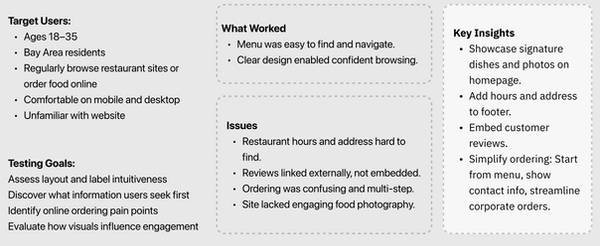
High fees and poor UX on third-party platforms hurt small businesses.
Bentolicious relied on DoorDash for online orders, losing 25% per transaction. Their existing website was outdated, non-mobile-friendly, and lacked direct ordering—forcing customers to call in or use third-party apps.
We conducted user survey across 100+ customers, below are some key insights:
-
68% preferred ordering directly to avoid fees.
-
Top frustrations: menu readability, no pickup ETA, payment errors.
Through chatting with the store owners, we also noticed that staff struggled with manual order entry from phone calls, so printer integration was critical for kitchen workflow.
Research
Our team visited the restaurant to understand its culture and environment. We observed how the owners greeted regulars by name, displayed family photos behind the counter, and prepared each meal with visible care. This authenticity inspired the site’s warming tone and the slogan “Cooking From A Mother’s Heart”, reflecting the warmth and sincerity of the brand.
Ethnographic observation:


Brand Psychology:
-
Brands with stories and social proof help build authenticity and trust
-
Consistency is an indicator of reliability
-
Warm and welcoming branding would help build emotional connection
Usability Testing:
Competitive Analysis:
-
Streamlined ordering is essential.
-
Highlighting Taiwanese authenticity and its family values would be a key differentiator.
-
Bentolicious would be catergorized as fast and authentic.
-
Since target customer is corporate clientele, branding should be professional yet inviting.

Solution
A responsive website with a streamlined menu, integrated pickup orders, and fee-free payments using PayPal.
-
Redesigned website with a warm, inviting aesthetic to reflect the brand’s authenticity.
-
Restructured menu for quick browsing and highlighted signature dishes with appealing imagery.
-
Simplified the ordering process with clear, step-by-step navigation from selection to checkout.
-
Embedded customer reviews, and added visible hours and location for easier access.
-
Maintained consistent branding and tone throughout the site to create a professional yet personal experience.
UX Engineering:
-
Improved overall usability and engagement, achieved 95+ Lighthouse scores via lazy loading and image optimization on mobile.
-
Implemented a back end online ordering system with firebase and WebSocket.
-
Set up the payment system on the website to avoid 3rd party platform fees/


Reflections
-
By conducting surveys with carefully crafted questions, we were able to gather meaningful insights that guided our decisions regarding the information architecture.
-
While our focus was primarily on a digital solution, visiting the restaurant in person provided valuable context about local competitors, including nearby dining options and the variety of cuisines offered.
-
Implementing interactive components was harder than expected given limited resources.
bottom of page